Understanding the Importance of a Welcome Sign
A wedding welcome sign serves multiple essential functions, playing a crucial role in establishing the ambiance of the event from the moment guests arrive. As the first visual element they encounter, a well-designed welcome sign sets the tone for the entire occasion. It reflects the couple’s personal style and theme, reassuring guests that they are entering a thoughtfully curated space that embodies the couple’s vision. This connection is vital, as it allows attendees to feel more engaged and aligned with the celebration.
Additionally, a wedding welcome sign acts as a formal greeting to guests, making them feel instantly welcomed. It conveys warmth and hospitality, illustrating that their presence is cherished. This initial reception can ease any potential anxiety for guests, allowing them to relax and enjoy the festivities. An effective sign should include phrases that convey gratitude and excitement about the guests’ attendance, creating an emotional resonance that can enhance the overall experience.
Furthermore, welcome signs commonly provide essential information that helps guests navigate the event more seamlessly. This includes details such as the names of the couple, the date, and key information about the day’s schedule, potentially highlighting the ceremony start time or the location of the reception. Having all this information readily available ensures that guests are well-informed, allowing them to engage fully with the celebration without confusion.
Incorporating an engaging welcome sign into the wedding décor can significantly enhance the overall theme. By aligning the sign’s design, colors, and materials with the wedding’s aesthetic, couples can create a cohesive visual narrative that resonates with their individual style. Ultimately, a thoughtful welcome sign not only fulfills practical functions but also enriches the emotional atmosphere of the occasion, creating a memorable experience for all attendees.
Identifying Your Wedding Theme
Choosing a wedding theme serves as a foundational element that shapes various aspects of the celebration, including decor, attire, and even the welcome sign. Different types of wedding themes, such as rustic, modern, vintage, or beach, each present unique characteristics and elements that can reflect the couple’s personal style. Understanding these themes is essential for couples looking to create a cohesive atmosphere on their special day.
Rustic weddings often incorporate natural materials, earthy color palettes, and warm lighting. Elements such as wood, burlap, and seasonal florals define this theme, offering a cozy and intimate atmosphere. In contrast, modern weddings showcase sleek lines, minimalism, and contemporary materials, utilizing bold colors and geometric patterns to evoke a stylish, urban feel.
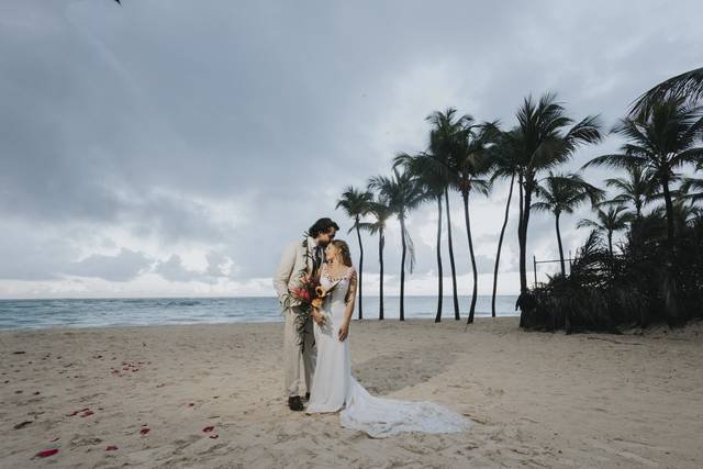
Vintage themes evoke nostalgia through the use of antique items, lace details, and soft color schemes that highlight a bygone era’s charm. The welcome sign in a vintage-themed wedding can reflect this by using elegant typography paired with decorative elements that mimic popular design trends from the past. Beach weddings promote a relaxed, informal vibe, often leaning on tropical colors, shells, and airy fabrics. Welcome signs for beach weddings can incorporate ocean-inspired motifs and vibrant colors that resonate with the beachfront surroundings.
To identify their preferred wedding theme, couples can draw inspiration from various sources. It may be helpful to consider their personal styles, identifying colors that resonate with them, along with elements from their favorite experiences or travels. Engaging with platforms like Pinterest or wedding blogs can provide valuable insight and visual inspiration. Ultimately, the chosen theme will influence not only how the couple’s welcome sign looks but also the overall aesthetic of the wedding, laying the groundwork for an unforgettable event.
Choosing the Right Materials
When designing a wedding welcome sign, selecting the appropriate materials is crucial to achieving the desired aesthetic and functionality. Various options are available, each with its distinct advantages and disadvantages.
Wood is a popular choice due to its natural charm and versatility. It can be stained or painted to complement virtually any wedding theme, from rustic to elegant. Additionally, wood is relatively durable, although its longevity may be affected by weather conditions if used outdoors. One downside is that wood can be heavy and may require more effort for transportation and installation.
Acrylic is another excellent option for modern wedding welcome signs. This material offers a sleek, polished look that can be easily customized with vinyl lettering or painted designs. Furthermore, acrylic signs are lightweight and resistant to weathering, making them suitable for both indoor and outdoor displays. However, they can be more expensive than other materials, and scratches may be more noticeable on their surface.
Chalkboard signs have a casual and whimsical appeal, ideal for vintage or bohemian-themed weddings. They allow for easy customization and can be updated as needed. However, chalkboard surfaces may require regular maintenance, such as reapplying chalk or cleaning to ensure legibility. Additionally, exposure to elements could compromise the appearance over time.
Lastly, metal signs are a durable and contemporary option, perfect for industrial or modern weddings. They can withstand harsh weather and lend an upscale feel to the decor. However, customization can be limited compared to other materials, and they may require professional fabrication to achieve intricate designs or typography.
Each material presents unique characteristics, making it essential to consider the wedding theme, location, and desired visual impact when making a decision.
Color Schemes and Typography
The choice of color schemes and typography plays a pivotal role in designing a wedding welcome sign that harmonizes with the overall theme of the event. When selecting colors, it is essential to consider the wedding’s primary palette, as these hues should reflect the couple’s personal style while maintaining visual coherence. For instance, if the wedding features a rustic theme, earthy tones such as forest green, burnt orange, and soft browns may be ideal, evoking a natural atmosphere. Alternatively, a beach wedding could favor pastel colors like seafoam green, coral, or sandy beige, drawing inspiration from the surrounding landscape.
To ensure optimal readability, the contrast between the background color and the text is crucial. A light text on a dark background or vice versa enhances visibility, so it is important to test different combinations before finalizing the design. Additionally, limiting the color palette to three or four complementary shades can create a polished appearance, allowing the welcome sign to integrate seamlessly with other wedding decor.
Typography is equally significant, as font choices can convey the event’s mood and theme. Serif fonts evoke a traditional and formal feel, ideal for classic or elegant weddings, while sans-serif fonts provide a modern touch that suits contemporary themes. Script fonts can add a romantic flair, but care must be taken to ensure that they remain legible, particularly from a distance. When selecting fonts, maintaining a clear hierarchy is advisable, meaning the couple’s names or significant text should be bold or larger, guiding guests’ attention appropriately.
Incorporating Personal Touches
Personalization plays a pivotal role in creating a memorable wedding welcome sign. It serves not only as an introduction to your special day but also as a reflection of the couple’s journey, values, and unique love story. By integrating personal touches into the design, you can enhance the overall ambiance and emotional connection of your wedding theme.
One effective method to personalize your welcome sign is by including a meaningful quote that resonates with both partners. This could be a line from a favorite song, a cherished literary passage, or even a phrase that captures the essence of your relationship. Such quotes can evoke feelings and memories, setting the tone for the occasion while communicating the couple’s bond to their guests.
Incorporating images or symbols that are significant to the couple can further elevate the welcome sign’s personal touch. For instance, you might use a photograph of the couple on a memorable trip or a symbol that represents their shared interests, like a mountain for outdoor enthusiasts or a book for literature lovers. These elements not only add visual appeal but also narrate the couple’s shared experiences, making the sign more relatable to guests.
Additionally, consider using thematic colors, styles, or materials that align with the wedding decor. If your wedding theme is rustic, utilizing wood or burlap for the sign could create a cohesive look. On the other hand, a contemporary wedding might benefit from a sleek acrylic or metallic design. Color palettes that mirror the wedding flowers or décor can tie the welcome sign into the overall aesthetic seamlessly.
Overall, personal touches in the design of your wedding welcome sign are instrumental in crafting a warm and inviting atmosphere that captures the spirit of your love story and enhances the theme of your celebration.
Placement and Size Considerations
When designing a wedding welcome sign, the placement and size of the sign are crucial elements that significantly affect its visibility and overall impact. First, consider the location where guests will first arrive. This is often at the entrance of the venue, so positioning the sign where it can be easily seen is essential. A well-placed sign can set the tone for the day, welcoming guests and orienting them to the festivities ahead.
Choosing the right size for the welcome sign is equally important. The dimensions should align with the venue’s scale and the wedding theme. For instance, if the ceremony takes place in a spacious outdoor setting, a larger sign may be necessary to ensure it captures attention from a distance. Conversely, in a more intimate venue, a smaller sign might be more suitable, enabling it to complement rather than overshadow other decorative elements. A general recommendation is to aim for a size that is easy to read yet harmonious with the surrounding decor.
Additionally, visibility can be enhanced by considering the surroundings. If the sign is to be placed against a busy backdrop, such as a floral wall or multi-colored decorations, selecting a color scheme that contrasts with this backdrop will help it stand out. Utilizing materials that reflect your overall decor can also elevate its presence. While it is important for the welcome sign to be noticeable, it should seamlessly integrate with the wedding’s aesthetic, ensuring it contributes positively to the overall environment rather than detracts from it.
In conclusion, careful attention to the placement and size of a wedding welcome sign is vital for its effectiveness. Thoughtful placement and appropriate dimensions can enhance the guest experience, ensuring a warm and inviting atmosphere right from the start of the celebration.
DIY vs. Professional Design
When it comes to designing a wedding welcome sign, couples often face the decision of whether to create the sign themselves (DIY) or to hire a professional designer. Each option has its unique advantages and challenges, which can significantly influence the final outcome of the sign and the overall wedding experience.
One of the primary factors to consider is the budget. DIY projects generally tend to be more cost-effective, as they eliminate the need for professional fees. However, couples must consider the potential costs associated with purchasing materials and tools, which can add up quickly. In contrast, hiring a professional designer may appear more expensive upfront, but it can save time and reduce stress. Professionals often have access to high-quality materials and tools, as well as the experience necessary to create a sign that perfectly aligns with the wedding theme.
Another essential aspect to evaluate is the couples’ available skills. If they possess a flair for creativity and design or have experience working with similar projects, a DIY approach can lead to a personalized touch. This hands-on experience can also make the welcome sign more meaningful. However, for those who lack creative skills or experience in design, the outcome may not meet expectations, potentially detracting from the overall aesthetic of the wedding.
Time constraints also play a critical role in making this decision. Designing a welcome sign from scratch may require considerable time and effort, particularly if additional homemade elements are included. Couples with limited time might prefer to rely on professionals who can generate concepts quickly and efficiently. The benefits of customized designs offered by professional designers should not be underestimated. They often bring a wealth of knowledge, experience, and innovative ideas that can help create a standout welcome sign that enhances the wedding ambiance.
Inspiration and Examples
The design of a wedding welcome sign serves not only as a practical guide for guests but also as a significant representation of the couple’s theme and personality. Various inspiration sources can aid in crafting the perfect sign that harmonizes with the wedding’s overall décor. One excellent starting point is Pinterest, which offers a vast collection of visual ideas. By searching for keywords related to wedding themes—such as “rustic wedding welcome signs” or “elegant wedding signage”—users can explore countless designs that resonate with differing aesthetics.
Additionally, wedding blogs play a crucial role in providing real-life examples and case studies. Websites like Wedding Chicks and The Knot consistently feature wedding stories that showcase beautifully designed welcome signs. These resources often delve into the details of how the signs align with the couple’s chosen theme, whether it be vintage, bohemian, beach, or classic romance. Through these narratives, one can gain insights into font choices, color palettes, and materials used, all of which contribute to crafting a personal and unique welcome sign.
Furthermore, social media platforms, particularly Instagram and Facebook, have become invaluable tools for discovering wedding inspiration. Couples can search hashtags such as #WeddingWelcomeSign or #WeddingSignage to find diverse examples that appeal to their aesthetic preferences. This visual platform allows future brides and grooms to connect with vendors and artists who specialize in custom wedding signs, paving the way for unique designs tailored specifically to their wedding theme.
Lastly, wedding magazines like Brides and Martha Stewart Weddings offer curated collections of wedding signage ideas. These publications often feature professional photography and expert advice, providing additional creative prompts for couples seeking to create an inviting atmosphere from the moment their guests arrive. Ultimately, using multiple sources enhances the chances of finding that perfect welcome sign style that reflects one’s unique wedding vision.
Final Tips for Creating Your Wedding Welcome Sign
Designing a wedding welcome sign that seamlessly integrates with your overall theme requires attention to detail and careful planning. One of the most crucial steps in this process is to proofread your final design. Spelling errors, incorrect dates, or mismatched names can create confusion and detract from the elegance of your wedding presentation. Take the time to read through the text aloud, or ask a trusted friend or family member to review it as well, ensuring that everything is accurate before it goes to print.
Another essential factor to consider is the alignment of your sign. Proper alignment not only enhances the aesthetic appeal but also ensures that your message is clearly legible. When designing your sign, make use of alignment tools offered by your graphic design software or online design platforms. Each element—whether it be text, images, or embellishments—should be positioned thoughtfully to guide the guest’s eye smoothly across the sign.
Lastly, collaborating with your wedding decorators can significantly enhance the overall effect of your welcome sign. Coordinating with these professionals ensures that your sign complements other elements of the decor, such as centerpieces, table arrangements, and color themes. Discuss the placement of the sign—whether it will be near the entrance, guestbook station, or ceremony area—and confirm that it will be prominently displayed for all guests to see. Additionally, ensure that the material and design of the sign are consistent with other decor elements, creating a cohesive and inviting atmosphere for your guests.
By following these practical tips, you can create an impressive wedding welcome sign that not only communicates your heartfelt greetings but also enhances the overall ambiance of your special day.
